Crafting Digital Dreams: Mastering the Art of Web Design
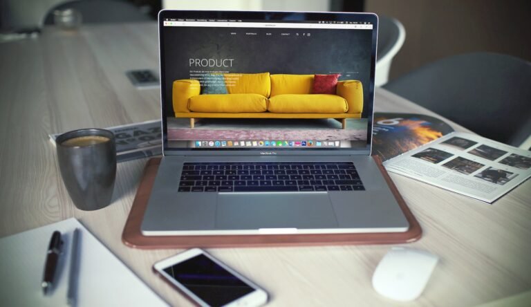
In today's digital age, your website is often people's first interaction with your business or personal brand. It's your digital storefront. Just like a physical store, its design can greatly impact the impression it leaves on visitors. This is where the art of web design comes into play, transforming digital spaces into captivating and functional platforms.
Web design also includes web apps, mobile apps, user interface (UI) design, and user experience (UX). Did you know that web design can greatly impact your performance in search engines like Google? This article will give you some helpful insight into how to create a website that not only looks good but functions.
Read on to learn about the art of web design, the needed tools, and website builders. You can also get bonus tips to create dynamic websites that rank on search engines and capture the target audience.

What is web design?
Web design refers to a multifaceted discipline that combines creativity, technology, and psychology to create digital experiences that captivate and engage users. Whether you're designing a personal blog, an e-commerce platform, or a corporate web page, the principles of effective web design remain largely the same. It's about crafting a digital dream that looks stunning and functions seamlessly.
At its core, web design is about creating an experience that focuses on clarity and usability. It's about understanding the user journey and designing for their needs. Web designers strive to make sure users can find the information they're looking for quickly and intuitively.
What is web development?
Web development is the process of taking a web design and turning it into a fully functioning website. It involves the implementation of the design's functional aspects, from creating complex features and applications to coding the basic structure of the website layout.
Web developers work closely with user interface design to bring the envisioned digital life experience, ensuring all design elements perform as they should.
It is, however, divided into two primary areas: front-end and back-end development.

Front- End Website Development
Front-end development, often called client-side development, concerns everything the user interacts with on the site. It involves translating the web design into a user interface using coding languages like Hyper Text Markup Language (HTML), Cascading Style Sheets (CSS), or JavaScript.
The front-end web developer’s job is to ensure the site's layout appears as intended across different screen sizes and browsers. And that it provides an intuitive, user-friendly experience.
Back-End Website Development
Back-end website development, on the other hand, is all about the server side of things. It pertains to everything happening behind the scenes that the user doesn't see but is crucial for site functionality. This includes server scripting, building APIs, handling database interactions, and ensuring data integrity.
Back-end developers use programming languages like Python, Java, and Ruby to create the logic of the site, manage data, and interact with servers, applications and databases.
The Fundamentals of Web Design
Understanding User Experience (UX)
At the heart of web design is the concept of User Experience (UX). UX design focuses on creating user-friendly, responsive websites that provide a satisfying experience to visitors.
UX design isn't just about creating a visually appealing website; it's about understanding the psychology of site visitors and crafting an experience that meets their needs. To ensure successful outcomes, UX designers take into account factors such as website navigation elements, information architecture, site speed, and responsiveness.

Maximize the use of HTML Tags
Web developers create most websites by using a coded language called Hypertext Markup Language (HTML). To successfully display a website on the client browser, it needs to follow the rules of this language. HTML tags identify the website's content for every page. Designers then use Cascading Style Sheets (CSS) to define the overall visual appearance of each page. The result is based on the combination of these elements. Hand coding can be taxing for some designers so some opt to use programs like Adobe Dreamweaver.
Engaging Content
Content is a major component of web design. And it's essential to ensure that your content is engaging, relevant, and helpful. Think about the type of content you want to share with users to inform, educate, and inspire them. You can use written content or create visuals to capture the interest of your target audience.
Pay attention to grammar, syntax, and formatting. Your content should be easy to read and understand. Additionally, add internal links to encourage users to explore other areas of your website.
Web Design Elements
Web design elements are the building blocks of a website, serving as the visual aspects that users interact with directly. They hold significant importance in web design as they contribute to the site's overall aesthetic, functionality, and user experience.
Web design elements include layout, color scheme, typography, and images. The layout of a website needs to be intuitive and easy to navigate, guiding the user's journey through the site. The color scheme should be representative of your brand and appeal to your target audience.
Typography plays a critical role in enhancing readability and setting the tone of your website’s content. Images, graphics, and animations can visually communicate your brand's message and engage users.
Enhancing the User Experience with Animation
Animation is an effective way to create a visually engaging experience. Designers use animations to draw attention to certain features or to illustrate complex concepts in an easy-to-understand manner. From subtle hover effects and transitions to animated graphics, there are many ways you can add motion elements to your web design.
When using animation, it's important to ensure that the motion elements are not distracting or overwhelming. Test your animations on different devices and browsers (Internet Explorer, Safari, Mozilla Firefox) to make sure they function as intended.
Additionally, consider performance when implementing animations: use lightweight animation libraries like GSAP to keep page load times fast.

Prioritize Mobile Responsiveness
A well-designed website is mobile responsive. Today's users access websites from a variety of mobile devices, including smartphones, tablets, and desktops. If your website isn't mobile-friendly, you risk alienating a large portion of potential customers.
When creating a mobile-responsive design, ensure that all key elements such as fonts, colors, and images are cohesive and in alignment with your brand voice. Additionally, use the available screen real estate to display your content attractively and intuitively. For example, use a hamburger menu or collapsible menus to make navigation easier on smaller screens.
Finally, optimizing page load time is essential for mobile users; prioritize speed when designing your website's structure and test it regularly to ensure fast performance across devices.
Balance Blank Page
Negative space, also known as white space, is a learned skill in design. New designers might be intimidated by the blank page. But design isn't about filling space with as much information and graphics as possible. Instead, use typography, images, and negative space to direct a user's attention and create a seamless experience.
Best Design Practices
Minimalism
Minimalism, as the name suggests, is all about keeping the website design as simple as possible. This design principle prioritizes functionality and simplicity, eliminating unnecessary visual elements, and focusing on what's essential. The result is a clean, concise, and distraction-free interface. This allows users to navigate the site easily and intuitively, enhancing user experience.

Flat Design
Flat design is a stylistic approach that does away with any visual elements that give the illusion of three dimensions, such as drop shadows, gradients, and textures. Instead, it uses simple shapes, bright colors, and clear typography, resulting in a 2D aesthetic that looks modern and crisp.
Flat design not only looks good but also improves site loading times to just a few seconds. And works well on varying screen sizes, making it ideal for responsive design.
Dark Mode
Dark mode, also known as night mode, is a color scheme that uses light-colored text, icons, and graphical user interface elements on a dark background. It's designed to reduce eye strain in low-light conditions, often improving readability and reducing glare in darker environments.
Dark mode can also conserve battery life on OLED screens, as it requires less power to display dark colors than bright ones.
Light Mode
Light mode, conversely, is a color scheme that uses dark text, icons, and interfaces on a light background. This is the default mode on most operating systems and applications, offering optimal readability in bright conditions, such as daylight. Light mode provides a clean, simple, and minimalist aesthetic that's easy on the eyes in light conditions.
Switching between these modes is often a matter of personal preference. Some users find light mode more comfortable for daytime use and dark mode beneficial for nighttime browsing. However, both modes have their advantages and are now standard features in many website designs and applications. Thus, allowing users to customize their viewing experience based on their comfort and environmental conditions.
Two Common Web Design Methods
Adaptive Design
Adaptive design is a method in web development that involves designing different layouts for various screen sizes. When a user visits the website, the server detects the device’s screen size and chooses the most appropriate layout for it.
This method requires web designers to create multiple versions of a site for different devices such as desktops, tablets, or smartphones. The adaptive design approach ensures that the website looks and functions optimally on any device. Thus, providing a seamless and satisfying user experience.
However, it is worth noting that this method can be more time-consuming and costly. Due to the need to design multiple layouts, it demands meticulous maintenance for each version of the site.

Responsive Design
Responsive web design is another popular approach to web design that prioritizes adaptability and flexibility across a multitude of devices. Unlike adaptive design which requires specific layouts for each device, a responsive design allows a website layout to dynamically change and adjust according to the screen size and orientation.
This means one website layout works seamlessly on all devices, from desktops to tablets to smartphones. The principle behind responsive design is fluid grids where page elements are sized by proportion rather than fixed pixels. This fluidity translates into a consistent and user-friendly browsing experience, irrespective of the device used.
Responsive sites are also easy and cost-effective to maintain, as there is no need for multiple layouts.
Web Design Tools and Resources
Adobe Photoshop
Adobe Photoshop is a leading software in the field of graphic design and image manipulation. It's a versatile tool used by many web designers, artists, photographers, and professionals to create, enhance, or alter digital images.
The robust features of Photoshop allow users to perform simple tasks such as cropping and resizing images. It also allows complex processes like creating multi-layered graphics, designing web pages, and developing 3D designs. Its compatibility with various file formats and integration with other Adobe products make it an essential tool in any designer's toolbox. And the most widely used tool in the web design industry.

Sketch
Sketch is a vector-based design tool specifically built for modern web design and mobile app design. It's highly recognized for its user-friendly interface and efficient performance, making it a favorite among many UX/UI designers.
Sketch offers features such as artboards, symbols, and mirroring that support designing for different screen sizes and pixel densities. With Sketch, designers can easily create reusable components and manage their design systems effectively.
Moreover, Sketch also allows team collaboration and offers a cloud-based platform for sharing design components and libraries. It is, however, exclusive to macOS, limiting its accessibility to users of other operating systems.
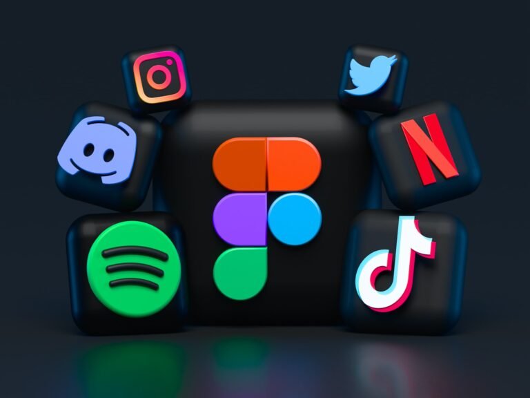
Figma
Figma is a browser-based design tool that helps with the collaborative process among teams. This interface design application is widely used for creating user interfaces and prototypes. Its cloud-based nature means team members can work simultaneously on a project, no matter their location.
Apart from its collaborative feature, Figma stands out for its robust vector editing capabilities, intuitive design features, and seamless integration with third-party applications, enhancing its functionality and versatility.
Additionally, it supports both Windows and macOS, thus not limiting its user base. Figma's usability, combined with its robust feature set, makes it a formidable tool in the arsenal of web designers and teams.

Adobe XD
Adobe XD is another significant player in the world of UI/UX design tools. It's a vector-based tool used for designing and prototyping user experiences for web and mobile applications. XD stands for Experience Design, reflecting its focus on the user experience aspect of digital product design.
Among its many features, Adobe XD excels in its integration with other Adobe tools, streamlined design-to-prototype workflow, and interactive prototyping capabilities. A freelance web designer can create wireframes, interactive prototypes, and animation, and then test them directly within the application or through a shared link.
Adobe XD also supports real-time collaboration, allowing team members to work simultaneously on a project, thus accelerating the design process. This tool is available on both Windows and macOS platforms, making it accessible to a broader group of users. With Adobe XD, designers have a powerful and versatile tool that can handle all stages of the design process, from ideation to prototype.
Canva
Canva is a cloud-based design tool that offers a simple and intuitive user interface, making it an excellent option for beginners and non-designers. The platform provides a wide array of predefined templates for various design needs such as social media posts, presentations, posters, and infographics, making it easier for users to start their projects. It also boasts a vast library of elements such as fonts, images, shapes, and icons that can be easily dragged and dropped onto the canvas, allowing users to create visually appealing designs with minimal effort.
One of the standout features of Canva is its collaboration capabilities. Multiple users can work on a design simultaneously, and designs can be easily shared with others for feedback or editing.
Canva also offers a mobile app, making it accessible on the go. Although it has a free tier with ample features, Canva also offers premium subscriptions which include additional resources and capabilities, making it a versatile tool suitable for a variety of design tasks.
Bootstrap
Bootstrap is a free and open-source CSS framework that aids in developing responsive and mobile-first websites. Developed at Twitter, it has become one of the most popular front-end frameworks and open-source projects in the world. Bootstrap includes a responsive grid system, extensive pre-designed components, powerful plugins built with jQuery, and Sass variables and mixins.
This framework makes web development faster and easier. It's made for people of all skill levels, devices of all shapes, and projects of all sizes. Bootstrap allows developers to build a responsive website with less effort and standardized conventions. This means a website built with Bootstrap will automatically adjust itself to suit the screen size it's being viewed on, ensuring a seamless browsing experience on all devices.
Bootstrap also offers a series of customizable features such as buttons, navigation bars, modals, image carousels and dropdowns, among others. In addition, it provides a set of good-looking default styles that can be easily customized to fit your unique design requirements. It also boasts compatibility with all modern web browsers.

Google Fonts
Google Fonts is a free and open-source library of nearly 1,000 font families that allows designers and developers to create rich typographic experiences on the web. Launched by Google in 2010, it provides an interactive directory for browsing fonts, making it easy for users to explore and choose the right font for their project. One of the main advantages of Google Fonts is its simplicity and ease of use. Users can add a chosen font to their website by simply embedding a small snippet of code.
Furthermore, all the fonts in the Google Fonts catalogue are optimized for the web, meaning they load quickly and have a minimal impact on page speed – a crucial factor for user experience and search engine optimization. Another standout feature of Google Fonts is its compatibility – the fonts work well across different screen sizes and resolutions, including devices with high-density Retina displays.
Moreover, Google Fonts supports a wide range of languages, and new ones are added regularly, enhancing its utility for global audiences. With Google Fonts, creating a unique and aesthetically pleasing typographic style on the web is both accessible and free of cost.
InVision
InVision is a digital product design and development platform used for creating user interfaces for mobile apps and websites. As a prototyping tool, it enables designers to create interactive and dynamic design mockups that bring their designs to life with animated transitions.
One of its remarkable features is the ability to transform static screens into clickable, interactive prototypes, providing a realistic simulation of the final product. Designers can create and test transitions between screens, interactions, and animations, thereby enhancing the user's experience during the testing phase.
Alongside this, InVision offers collaborative features that allow teams to work together on design projects. Feedback can be given directly on the designs and all changes are synced in real-time, making it a highly effective tool for teams working remotely.
Moreover, InVision seamlessly integrates with other design tools like Sketch, Adobe, and Figma, facilitating a smooth workflow. It is accessible via a web browser or through its mobile app, making the design process flexible and dynamic.
Used by some of the world's leading brands, InVision is an integral part of the UI/UX design process, taking designs from the concept stage to a fully interactive prototype, ready for user testing and feedback.

Where do I hire a professional web designer?
Designing a website may not be as complicated and you may not need technical skills to do it because there are website builders available for use but it takes time. It takes your focus away from running your business! Hence the need to hire professional web designers and the best place is through RDZ Technologies, Inc.
RDZ Technologies provides comprehensive design and development services for customers of all sizes. Their team of experienced web designers and developers specialize in creating amazing website designs that not only look great but are also optimized for maximum performance. They use cutting-edge technologies, such as HTML5, CSS3, JavaScript, AJAX and more to ensure that your website is modern and responsive on all devices.
Not only do they provide website design and development services, RDZ Technologies also offers digital marketing services for businesses looking to increase visibility and reach online. Their team of experts knows how to create SEO-friendly content that can help you rank higher on search engines. They will take your brand's message and communicate it effectively so that people can find it easily. And they offer the best prices! Contact RDZ Technologies, Inc. today for a free quote!