A Logo Design Primer: The Key Elements for Crafting a Captivating Brand Identity
Are you looking to create a strong brand identity? A logo is the first and most important step in developing your company’s visual identity. It’s essentially the face of your business, and you should carefully craft your logo to convey the essence of what you stand for.
Creating an effective logo design involves more than just throwing together a few shapes and colors. Graphic designers take into consideration many elements, including the type of font used, shape, size, color scheme and even symbols, when creating a logo design.
We have created a guide to show you the basic principles of logo design and some tools to create the perfect logo for your company! This guide will also provide you with much-needed insight into creating your logo and the brand strategy you can use to grow your business.
So read on and let’s start your brand’s logo creation journey!

What is a logo design?
A logo is a unique graphic design that represents your brand and conveys the message you want to communicate to your target audience. You will use your logo on digital platforms, business cards, clothing, hats, packaging, and other marketing materials.
It is also important to note that a logo is not the same as a brand. A logo is part of a larger branding strategy, which involves design elements such as fonts, colors, and messaging.
Why is a logo important in a business?
A logo is important in a business because it establishes an instantly recognizable visual representation of the company. Customers notice logos first and companies use them to build a strong emotional connection with the target market.
It also helps create brand recognition and loyalty among customers, as well as differentiate your business from other brands in the market. Furthermore, a strong logo design reinforces a company’s credibility and trustworthiness. Customers will associate the company logo with a legitimate business and would prefer to deal with them than those with unclear logo designs.
An example of a successful logo is the Apple Logo. Apple is known by customers as the leading phone or tablet store. Whenever customers purchase a new phone or iPad, they immediately go to Apple to purchase. Because the Apple logo reminds them of the brand!

What are the design elements of creating a memorable logo design?
The basic of logo design is creating a unique visual graphic design that reflects the mission, values, and objectives of your company. Here are the essential elements to remember in creating a new logo:
Typography or Font
Did you know that each font and typography has different meanings? YES, they have! For example, logo designers use a serif font like Times New Roman for formal and traditional designs, whereas sans serif fonts like Arial are for modern and contemporary designs.
Another important aspect to consider when selecting a font is legibility. Your logo should be easily readable in different sizes, otherwise, customers may not recognize it. It’s also essential to stick with one type of font to make the logo look unified and consistent.

Color Scheme
We all know that colors have powerful meanings and associations. Different hues can evoke different emotions, so it’s essential to choose a color scheme for your logo that reflects the personality of your company.
For example, if you own an eco-friendly business, you might want to stick with green as the main color. On the other hand, if you want to convey a feeling of trustworthiness and stability, you can opt for blue hues.
Iconography or Symbols
Do you know that symbols are great ways to communicate an idea without using words? YES! Adding an icon to your logo is not only visually appealing but also helps customers quickly understand what your business stands for.
You don’t have to use an existing symbol; you can also create your own that reflects the mission and values of your company. Just make sure it’s easily recognizable and looks good in different sizes and resolutions.
Shape and Size
People often overlook the shape of a logo, but it plays a key role in creating a memorable logo. It should fit in with the other design elements and also reinforce the message you want to convey.
It’s also important to consider the size of your logo, as it needs to be visible whether printed or viewed on a mobile device. It should also look good in different sizes and resolutions so customers can recognize it easily.
Symmetry and Design Balance
A good logo design needs to have a good sense of balance. Symmetrical logos are often the most visually appealing as they create a sense of harmony and stability. Designers use asymmetrical logos, on the other hand, to evoke emotions such as excitement or surprise. Therefore it depends on your company and what personality or message you are trying to convey with your logo.
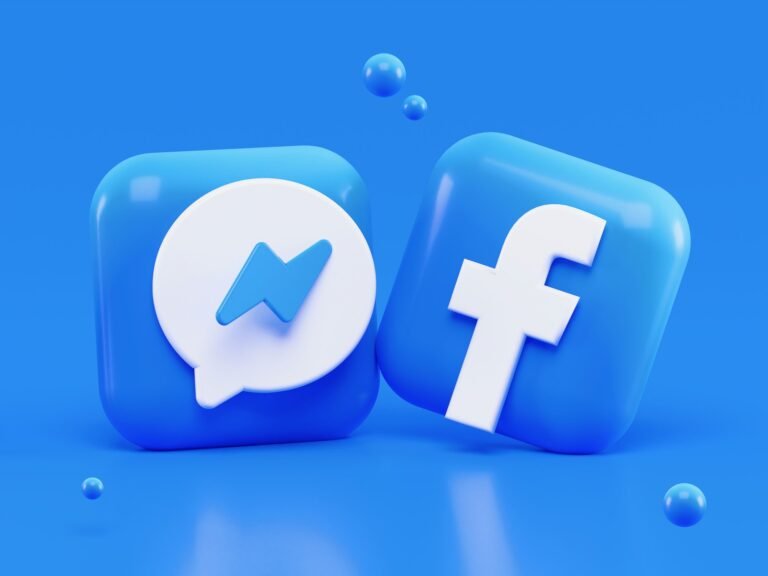
A sample of a logo design with a balance is Apple and Twitter. Both the Apple logo and the Twitter logo utilize circles of proportionate values as well as symmetry to create a pleasing, balanced aesthetic quality.

Complementary
Your logo’s graphic design and your typeface should work together (typically called a lockup) and should enhance one another. If your graphic design is clean and linear, a typeface that matches it should be chosen. If your graphic device is organic and flowing, then the complementary typeface should be as well.
What are the types of logo designs?
These are the categories of logo designs:
Wordmark
A wordmark logo consists of only text or words that usually form the name of a company or brand. It’s often used by well-known brands and companies with an established presence as they can be easily recognized and associated with the business.
Sample: Coca-Cola Logo

Pictorial Mark
A pictorial mark logo is composed of an image or symbol that usually relates to the company’s mission and services. It’s a great way to create a unique identity for your business without using words.
Sample: Apple

Abstract Logo
An abstract logo consists of shapes, symbols and other elements that have no relation to the company’s services or mission. Logo designers use abstract logos to create an interesting and unique visual identity for the business. But it should still accurately represent the core values of your brand.
Sample: Nike Swoosh Logo

Brand Mark
A brand mark logo is a combination of both wordmark and pictorial marks. It contains both text and symbols which helps to create a strong visual identity for the company.
Sample: McDonald’s Golden Arches Logo

Combination Mark
A combination mark logo is a combination of both pictorial and wordmark logos. It contains symbols, images, and text to create a unique visual identity for the company.
Sample: Burger King Logo

What are the logo design principles?
The perfect logo design is one that accurately reflects the company’s values, mission, and message. It should be timeless, memorable, legible, and appropriate for both digital and print media. Here are the basic principles of logo design to create the perfect logo:
Relevance
A logo is relevant if it connects with the objectives, mission, principles, and nature of the brand it represents. You achieve relevance by looking at your brand in depth, which can be done by researching your brand extensively. This means asking questions about the brand or organization a logo represents. For example: What are the brand’s target audience or stakeholders? What values does it cherish or promote? What’s its competition like? What does it wish to accomplish? A relevant logo can represent and reflect a brand’s most important values or ideals directly.
Simplicity
The best logos are clean and uncluttered. They are the ones that give the viewer an immediate and clear sense of “you.” In general, less is more and simplicity is more impactful. Remember that logos are used in a variety of ways, on different platforms and in various formats and sizes, so fine details will be lost.
A simple logo will have a few elements, each of which customers can identify easily and integral to what you’re hoping to communicate. If you have elements that don’t contribute to the whole, get rid of them.
You don’t want the viewer to have the burden of considering too many elements or attributes when they glance at a logo. You want them to see that thing or two that makes the logo stand out and become memorable.
In a space in which crowded or complex designs are the norm (such as deodorants), a minimalist design might make your brand distinct. And trust us when we say, a really simple logo can often be recalled after as little as a glance, something that’s not possible with an overly detailed design.

Versatility
A versatile logo should be able to work across different platforms and media such as print, digital, apparel, etc.
Your logo will be used in several ways and in multiple contexts. They will be used on t-shirts, baseball caps and fun packs. They will be used on pens, keychains and water bottles. Or on very horizontal and extremely vertical banners and both black and white backgrounds (make sure your graphic designer creates your logo in black and in white to satisfy these needs, if necessary) They could be very large and very, very small or alongside other company logos like those for specific products and services. Therefore your logo needs to be versatile.
Scalability
Going back to the adaptability principle, we know that your logo ought to be scalable to represent your brand anywhere. A scalable logo needs to make sense, look good and remain legible at any size—whether it is printed on a tiny business card or extremely vertical banners.
If you include too much detail in your logo it will make it harder to scale down to a small size. To achieve scalability in your logo, the graphic designer will create your logo in vector format. Vector files are created with rescaling in mind, so your logo looks just as sharp when it’s blown up to a large size.
Similarly, if your logo appears on a big surface of a billboard, as part of your billboard design, then the logo should not lose its sense of proportion. This means that the logo should not be stretched on one side. To make the logo design scalable, draw it with the help of design grids. This method works well to maintain a good sense of balance when scaling a logo.

Timeless Design
Would you like to create a new logo every second year? That is not possible for small businesses. Frequent changes in your original logo design are also not advisable for many reasons. If you redesign a logo so often, you are leaving your customers confused and directionless.
Portray the Right Message
Make a statement based on your brand and values. An effective logo has to make a strong statement – and the right statement – the first thing you must do is figure out what you’re trying to say.
Logos are symbols and as such should tell people what you mean to them (or what you want them to think or feel about your business). Effective logos portray the right message the first time around, and constantly remind people of the purpose of the brand.
The classic style evokes the images of a bygone era, which people fondly remember. Similarly, your logo’s vintage or retro style will take viewers to some happy memories from the past. For instance, a logo in hand-lettering with warm hues can evoke a feeling of nostalgia.
Or, choose a minimalistic design style for your logo simply. You will use minimum design elements to create a logo. Most such logos use negative space to explore the limited space best and convey a message. It may be that your brand personality tilts more toward fun and entertainment. In that case, your logo design style could be funny and witty.
What are logo design tips for the design process?
- Start by sketching your ideas
Sketching makes it easier to put shapes exactly where you want them – there will always be time to digitize your marks later. If you can do some sketching work, then chances are that you will come up with a unique logo idea.
It can also be useful to share some sketches when you’re describing design ideas to clients before digitizing a mark. This can make it easier for them to visualize the result without the distraction of typefaces and colors, which can sometimes cause clients to dismiss a whole idea. Don’t share too much though; only your best ideas.

- Begin in black and white
Logos are all about shape and form, so you should start by creating a black-and-white version of your first logo. This will help you to focus on the composition and make sure it works. Once it’s perfected, then you can move on to adding color.
- Consider negative space
Negative space or ‘white space’ is an important part of logo design. It is the area around a logo that isn’t filled with any elements or design elements. This space should be used to enhance the design and help create balance. Negative space can also be used to add visual interest and energy to a logo.
- Be mindful of typography
Typography is an important part of logo design and is worth paying attention to when designing a logo. Choosing the right font can strengthen your design and make it more memorable. Making sure it’s legible at any size is also important, so be sure to test it out before finalizing your design.
- Keep up with trends
It’s important to keep up with graphic design trends as they are constantly changing. This doesn’t mean that you should follow trends blindly, but staying up to date can help you create a more modern logo and stay ahead of the competition.

- Test your logo
Finally, it’s important to test your logo before finalizing it. It’s easy to get carried away by your design skills, so make sure that you take a step back and look at your work objectively.
What tools are used to create a logo design?
Adobe Illustrator is often considered the industry standard for a logo design tool. It’s a vector-based program which means it allows you to create graphics that can be scaled up or down without losing quality. Other popular programs used for logo design include Corel DRAW, Adobe Photoshop and Affinity Designer.
It’s also possible to do logo designing using free online tools such as Canva, LogoMakr and DesignEvo. These are much simpler tools that can be used by anyone regardless of their design experience. They allow you to quickly create your own logo with an easy-to-use template system and drag-and-drop interface.

Where do I hire graphic designers to create a logo for me?
RDZ Technology, Inc. is a place where you can hire highly experienced graphic designers to create memorable logos for you. Our team of professionals has the knowledge and expertise to create innovative, eye-catching designs that will help your logo stand out from other logos. We take into account your brand’s mission, values and personality to create a unique logo that accurately reflects your company.
RDZ Technology also offers digital marketing services to help you get the most out of your logo. From social media marketing to website design, our team is here to help you reach your goals with an effective strategy. Contact us for more information about our services and how we can help your business grow.
Get in touch with RDZ Technology today to see how we can take your logo design project to the next level. We look forward to hearing from you!

Conclusion
The right logo is recognizable and memorable. Combined with the right product, it can become a priceless asset – think of the Nike Swoosh, the McDonald’s golden arches and the Michelin man. But such logo designs don’t tend to come about by accident. To make the right impression, you’ll need to understand the core principles of logo design and follow some essential tips. Good luck!